What if you could understand why your users do the things they do? Or know what they want, so you can make a truly useful app? Or find out what drives them to open your app so they start coming back EVERY DAY?
Why do we sometimes make glaringly bad decisions?
Cognitive BiasWe all have them. Common thinking errors that trip up logical decision-making and gleefully beat it over the head.
1 in 5 users will never launch an app again after one session. It’s clear that apps need a secret sauce. That sauce’s name is habit. To be truly successful, apps need to be habit-forming. According to Nir Eyal, habits are shaped in a four part process:
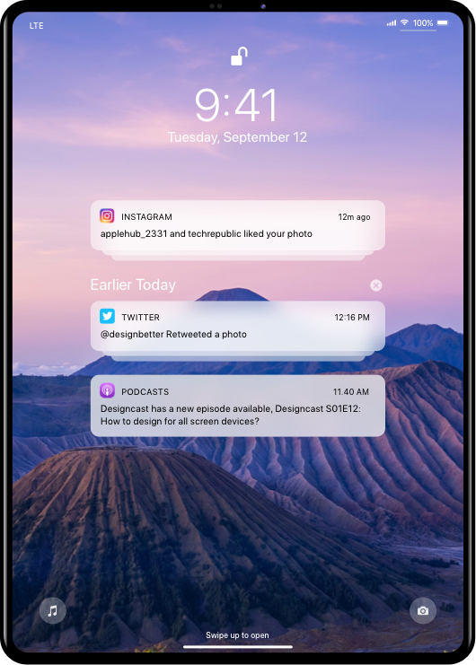
Habit forming technologies first cue a user to a certain action. External triggers include familiar things like push notifications that prompt an icon tap or a web click. Once you’re hooked on apps, you don’t even need an explicit trigger. In your mind, an association has been formed that the product = solution. Over time, the feeling that triggered the tap or click attaches to the product. Do you think about Google? No, you just google.
The action is the behaviour done in anticipation of a reward.The main thing here is to make the action as quick and effortless as possible. The more steps a user has to take, the less likely he is to complete the intended behavior. Minimizing effort will improve the experience on web and mobile.
Time for the user to do a little bit of work.A user’s “investment” may not be financial. They may invite friends, learn to use new features or give personal data. These improve their experience and trigger the next action.If, every time they pick it up, the app gets better and they have invested something it’s more likely to become a habit.
Gamification turns your boring jobs, to-do lists, even paying your bills, into an epic quest.People love to play. Take the ‘building blocks’ of games, and use these in real-world situations. Add the fun parts of a game, like badges, stories, levels, and points, to your non-game app. Gamification isn’t just about winning points. It forges an emotional connection, creating a feeling of accomplishment, empowerment through imagination, and social rewards.
Optimism Bias
The tendency to be over-optimistic
Design for a smooth customer experience, to keep the user at this sweet spot in the conversion process. A bad experience like a faulty user interface or unexpected charges immediately jolts them out of their optimism.
Negative Bias
The tendency to anticipate negative experiences
Design for empathy. We try to understand a user’s pain and solve the pain. People also remember the bad more than the good. A single usability flaw on your app will outweigh the positive features, so interfaces have to be not just good, but great.
Confirmation Bias
The tendency to confirm one’s own expectations
Design for personalisation. Using research-based journey mapping, we aim to understand a visitor’s world view. Deeply personalised targeting validates their ideas and beliefs, and leads to loyal users who feel good about your app.
Sunk Cost Fallacy
The tendency to justify increased investment in a mistaken decision
Design for motivation. We keep users invested using levels, rewards, social sharing, offers, points or tiers.
Anchoring Effect
The tendency to rely too heavily on one piece of information when making decisions
Design for first impressions. Just as the first price a customer sees is the one that will affect their future purchase decisions, your app has 50 milliseconds (.05 seconds) to create a lasting impression.
IKEA effect
The tendency to place a disproportionately high value on objects that we’ve worked on ourselves
Design to make people love the app. When we let users feel in control and put a bit of effort into your app, it forms a stronger bond. This can be as simple as setting up a profile, customising the app, or sharing it.
Goal Gradient
The tendency to work harder to achieve our goals when they're closer in sight
Design for progress. Since even the illusion of progress can encourage us to push on to a goal, we help users feel like they’re making progress. These incentives can be as basic as a pre-filled reward, countdowns, progress bars, levels, or heightened app sensations.
Cognitive Miser
The tendency to put the least amount of effort possible into problem-solving
Design for ease. Heuristics or mental shortcuts make sure that the user doesn’t have to expend too much effort. Our app design includes consistency, minimum steps, clear language, mapping, user control, and good error messages.